Exhibition Design & Interpretation
To tell a story in a space is a process of abstraction. Therefore when Designing an exhibition the essential first step is the content interpretation that is the process of “translation” of potentially boring facts (and figures) into a storyline that touches and engages the target public. This can be done in an infinite number of ways and the challenge and the trick is to find the best way to interpret a particular content and subtract a clear message that the story line will tell.
We believe that only an exhibition with a clear message and story is a successful exhibition.
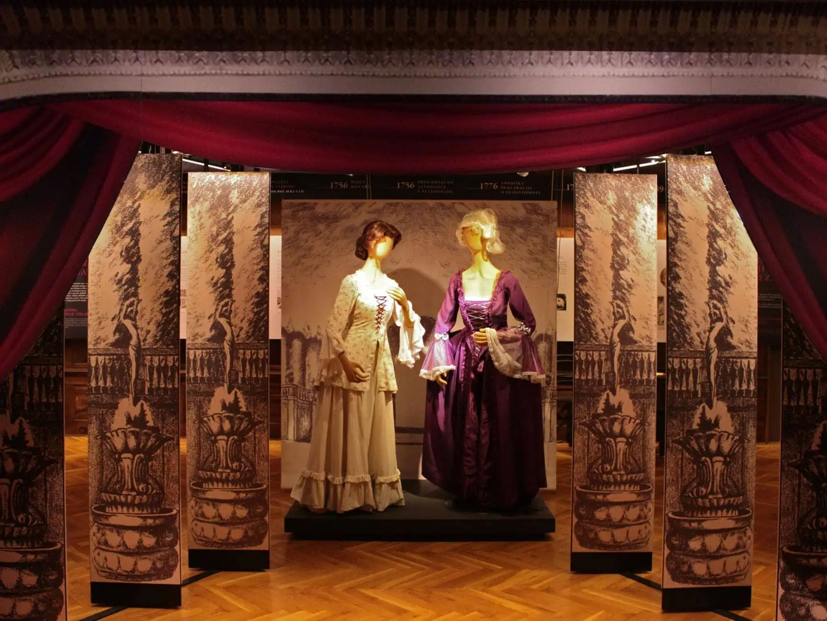
A few years ago we were invited to work on a small boutique exhibition about a family of a successful businessman. As the designers, were handed by the curator with a pile of archive documents on members of the family. Turning those into an exhibition directly would have been a disaster – a boring succession of copies of archive papers. Dead. Unengaging. Unappealing.
We decided to look for a way to bring the content closer to the visitor. With the help of a historian and the curator, we identified those family members, during whose life something significant had happened: the first one mentioned in any archive had been an important witness in a medieval court case; another one had been the head of the family when serfdom was abolished; yet another one the black sheep who had gambled away the family home… we decided to enable the visitors to look at these people in the eye: to meet them in the shape of life-size silhouettes, imaginary portraits, drawn by an artist. Moreover, we decided to commission a short imaginary monologue by these characters that they might have spoken or thought at crucial moments of their lives and that were reflected in the archives. Renowned actors interpreted the monologues, sound effects were added and they almost turned into vignette radio plays. They were presented on a touch screen as an interactive and to spice the exhibition further, 2 simple computer intaractives were also added to this area. As a result of this the visitors now leave the exhibition feeling they have met these characters and lived through a part of the history of this family.
This is an illustration of how to turn a potentially boring exhibition into an engaging one. This process is called content interpretation.
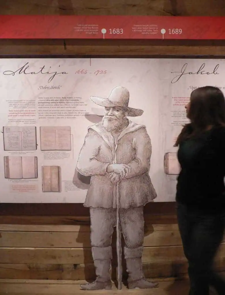
Content interpretation led us to discover interesting intersections between the countries history and that of the family members. We translated them into storylines that clearly displays these moments in time.
At AVCI+ we begin by working closely with curators on deciphering and translating what usually begins as very professionally and dryly written content into a form that will be understood and appreciated by the target public.
We call this process “combing” the content – as, like when combing tangled hair, you have to do it over and over again, until the last tangle is resolved and the way through is smooth. Usually we would hold a series of meetings with curators over a period of time.
Only after the content is “translated” in this way, after it is interpreted into a clear storyline with a clear message, the process of designing the exhibition as such begins. However, it is important to say, that the thinking process behind it starts from the moment the work on interpretation begins. In other words, ideally, they are intertwined.
Just like any good story, an exhibition storyline should also provide elements of good storytelling: a beginning that intrigues, a continuation that explains and then creates drama, the climax that tells the most important part of the story, and the end as a counterbalance to the beginning – a resolution. The design must support this storytelling in every possible way and here sometimes even take the lead.
THE DESIGN PROCESS
We believe that design should stay in the background and let the content take the lead. This means that every design decision should be informed by exhibition storyline, by its message.
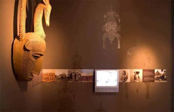
We always aim to tell the storyline as inventively as possible. Every potential means of expression, from shape, volume, colour, light and material to multimedia and interactions is considered and then matched with appropriate content segment. The totality is then carefully balanced and checked against the message that the exhibition is aiming to convey. Everything is conceived and designed with the visitor in mind and their experience is carefully devised and shaped. Different target groups of visitors are taken into consideration (e.g. children) and their experiences planned in parallel.
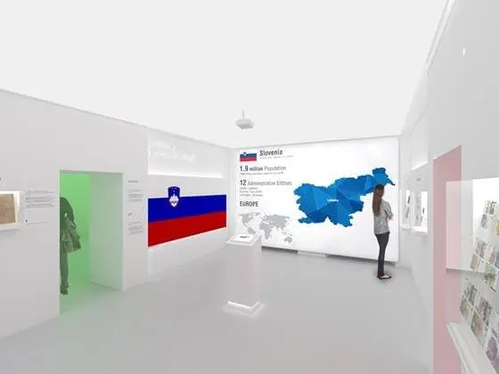
When designing exhibitions it is important to have in mind that visitors will perceive the content while moving through space. This is why it is important to design an exhibition in layers. Key views and positions need to be identified and key objects/content elements should be allocated these positions. These key positions in a way act like “chapter titles” and they will constitute the image and the message of the exhibition that even a visitor who walks through it fast will get. Smaller anchor points are devised around these key positions and they attract the attention of visitors who decide to linger on for longer. When they do that, they may notice a further, subtler layer that needs discovering. Even further layers can be created that are so subtle that they only contribute to the feel and the atmosphere and are possibly perceived by the visitor only on a subconscious level.
This careful designing, positioning and layering of the exhibition elements is essential also for another reason: today’s visitors are used to being constantly bombarded with all kinds of visual messaging. They are quickly bored; having all the information they need at their fingertips at any one time. The aim of an exhibition should therefore never be to provide as much information as possible, but to provide the chosen information and convey it in a clear way. In the end, we all know that the same story can be presented in any number of ways, so what we are interested in, when designing an exhibition, is to present the chosen story in such a way that the visitors will get the desired perspective on it.
Going more into detail, we always design in such a way that clear elements are established that run throughout the exhibition (e.g. graphic panels, spatial divisions, space titles, etc.). These represent the relatively neutral visual basis of the space. This provides the visitor with a comfortable and legible surroundings into which more important spatial and visual events can occur, e.g. a uniquely designed architectural element, a secluded entrance that offers the visitor an individual experience, a surprise.
All this, of course, is to tell the story we are trying to convey in the best way possible.
Sanja Jurca Avci, December 2011


